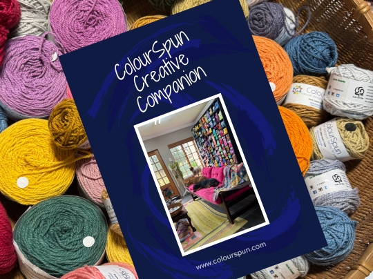
Stuck on Colour? Here’s How to Find Combinations You’ll Love
Choosing yarn colours for a project can feel exciting, or completely overwhelming. Where do you even begin when there are an infinite number of beautiful colours and no obvious “right” answer?
The truth is that colour sense isn’t something you either have or you don’t. It’s something you develop, slowly and enjoyably, by paying attention to the world around you. Here are some of the ways I’ve learned to find colour combinations that sing.
Think Like an Artist
Artists don’t wait for inspiration to arrive. They train themselves to notice it everywhere. You can do the same.
Start paying attention to the colours and textures in ordinary things: the tile pattern on a café floor, the colours in a stained-glass window, the faded pattern on an old Persian rug, the peeling paint on a weathered wall. Look at buildings, fabric, patchwork, ethnic artwork, magazine spreads and paintings. Whenever you see something that catches your eye, ask yourself: could I imagine a project in these colours?
Keep your phone or camera handy and photograph anything that strikes you. A rock wall, a market display, a bunch of flowers in a paper wrap. These small moments of noticing are where your colour sense begins to grow.

Learn From the Work of Other Artists
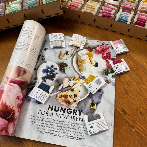
One of the easiest places to start is with things that other artistic people have already made: paintings, fabric, quilts, tapestries, illustrated books.
These are particularly useful because, unlike a fleeting sunset or a garden in bloom, they don’t change. You can return to them, study them, and really sit with the colour relationships. Notice which combinations draw you in and which leave you cold. Pay attention not just to the individual colours, but to how they work together. Which ones lead the eye, which ones recede, which ones create energy or calm.
Books and magazines are excellent colour references. Build a collection of images that speak to you and refer back to them when you’re planning a new project.

Turn to Nature for Colour Inspiration
When it comes to choosing yarn colours, nature is the original colourist, and she is endlessly generous with ideas.
A single sunset can hold deep red, burnt orange, soft gold, dusty rose and the palest grey-blue: a complete palette in one sky. A flowerbed of nasturtiums, daisies and alyssum gives you deep orange, clear yellow, true red, soft blue, mauve and off-white all growing together in cheerful harmony. Even a patch of lichen on a stone wall has its own quiet, complex palette.
The catch with nature is that it keeps changing. That perfect combination of cloud colours exists for minutes, not hours. Photograph what you see as soon as you see it, because without a photo for reference it can be surprisingly difficult to recall exactly which shades you loved and why.
Use a Colour Wheel or Paint Sample Cards
If you’d like a more structured approach to colour, a colour wheel is an invaluable tool and well worth the small investment. Most art shops carry them.
On a colour wheel, the three primary colours (red, yellow and blue) are separated by the secondary colours they create: orange, violet and green. This simple relationship unlocks a lot of colour decision making.
Colours opposite each other on the wheel, known as complementary colours, create a striking, high contrast combination. Think red and green, or orange and blue.
Colours that sit next to each other on the wheel, known as analogous colours, are naturally sympathetic to one another and tend to create a harmonious, restful effect.
A good colour wheel will also show you tints (a colour mixed with white, making it lighter), hues (the true, pure colour) and shades (a colour mixed with black, making it darker). All of these are useful when you’re working with yarn in a range of tones.
Paint sample cards work on a similar principle. The colours on each card are chosen to complement one another, and the staff at your local paint shop will happily explain how they work. They’re free, endlessly available, and surprisingly useful for planning yarn colour schemes.

Choosing Your Yarn Colours: Working With What You Have
Once you have a colour direction in mind, it’s time to work with what you have.
Sort your yarn into colour families first: blues, reds, warm autumn shades, soft neutrals, depending on the feel you’re going for. Then start pulling combinations together and don’t be afraid to mix. When working with many colours in one project, pink, orange and red can all live happily side by side. What seems bold on paper often looks beautiful worked up in yarn.
If you’re new to multi-colour projects, starting with a variegated yarn is a gentle entry point. Choose your other yarns to pick up colours already present in the variegated, and the palette more or less builds itself.
Once you have a selection, pack everything together on a tray or in a basket so you can see how the colours and textures relate to each other. Take out the ones that don’t quite work and try alternatives until the combination feels right. There are no strict rules. I’ve knitted garments using over 100 different colours and textures, and the joy is always in the exploring.
Not sure where to begin? Our ready made colour ways take the guesswork out of choosing yarn colours, each one is curated with colour relationships already in mind. You will find a lovely selection in our Colour Packs section.

Colour confidence comes with practice and with paying attention. Start noticing, start photographing, start playing, and before long you’ll find colour combinations arriving naturally, almost without effort. That’s the moment when choosing yarn colours stops feeling like a puzzle and starts feeling like the best part of the whole process.
Frequently Asked Questions
How do I choose yarn colours for a project?
Start by training yourself to notice colour combinations in the world around you: tiles, rugs, paintings, fabric, nature. Photograph anything that catches your eye and use those images as a starting point. A colour wheel or paint sample cards can help if you prefer a more structured approach.
What is a colour wheel and how does it help with yarn selection?
A colour wheel shows the relationships between colours. Complementary colours sit opposite each other and create high contrast combinations. Analogous colours sit next to each other and create harmonious, restful palettes. Most art shops carry colour wheels and they are a worthwhile small investment for any crafter.
What are complementary colours in yarn crafts?
Complementary colours are colours that sit directly opposite each other on the colour wheel, such as red and green, or orange and blue. Used together they create a striking, high contrast effect in knitting, crochet and embroidery projects.
I am new to choosing multiple colours. Where should I start?
A variegated yarn is a gentle entry point. Choose your other yarns to pick up colours already present in the variegated, and the palette builds itself naturally without much guesswork.
Does ColourSpun offer ready made colour combinations?
Yes. ColourSpun Colour Packs are curated collections with colour relationships already considered, taking the guesswork out of choosing yarn colours for your next project.
Can you mix colours like pink, orange and red in one project?
Absolutely. What seems bold on paper often looks beautiful worked up in yarn. Sorting your yarn into colour families first and then laying combinations out together on a tray helps you see what works before you commit to a project.